The expansion of Verizon's offerings led to customer confusion regarding the whereabouts of products and services.
Update & simplify the My Verizon App information architecture. I was focused on revamping the IA for the shop experience nable easy navigation & promote the discovery of new products
The Challenge: Verizon’s online store struggled with low product discovery and high drop-off rates, making it difficult for customers to explore and purchase products effectively.
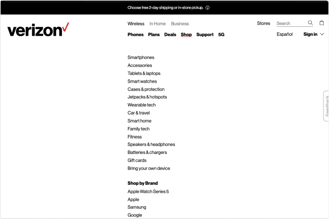
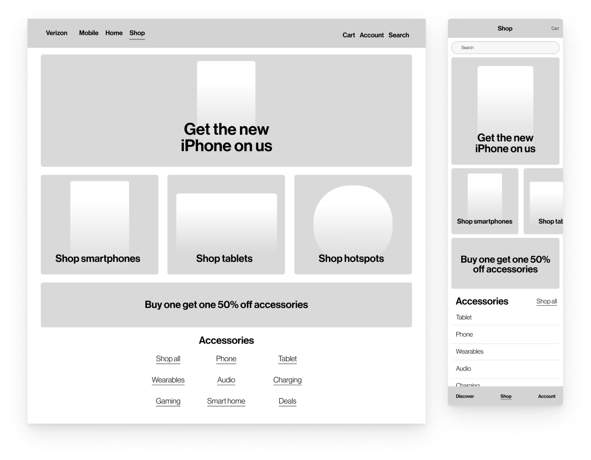
Current Landscape: The existing experience was overloaded with content and lacked intuitive navigation, forcing customers to rely on search instead of natural browsing. Competitor platforms had simplified category navigation and more contextual sub-navigation
Plan of Action
Understanding Behaviors:
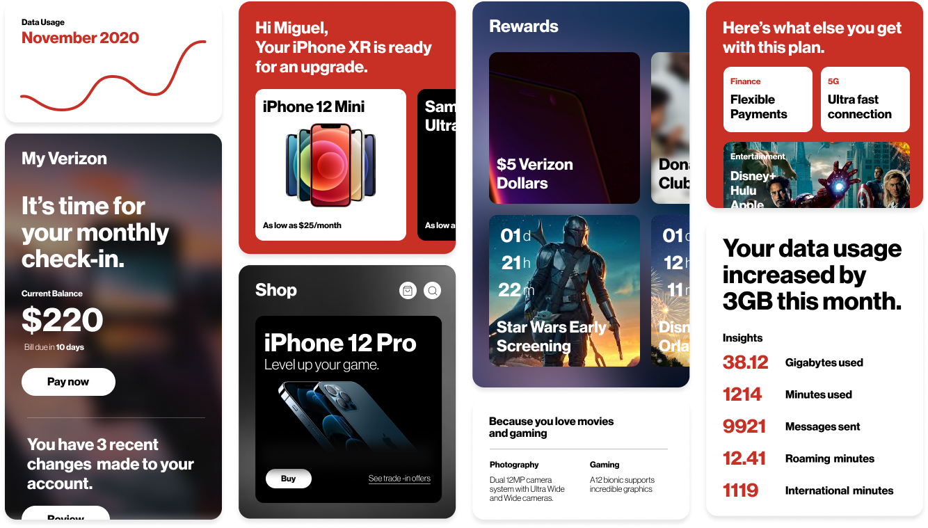
Research revealed that customers wanted easier ways to browse product categories.
Testing Navigation Improvements:
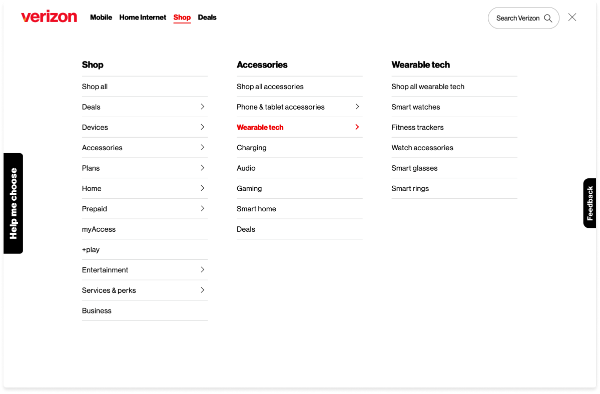
Introduced sub-navigation at the page level to surface relevant product categories.
Prioritizing Users:
Reduce friction in category exploration (immediate impact on engagement). Optimize for mobile-first browsing to further increase conversions.
Path forward
By aligning navigation with how customers naturally explore, we improved engagement, discovery, and sales performance.
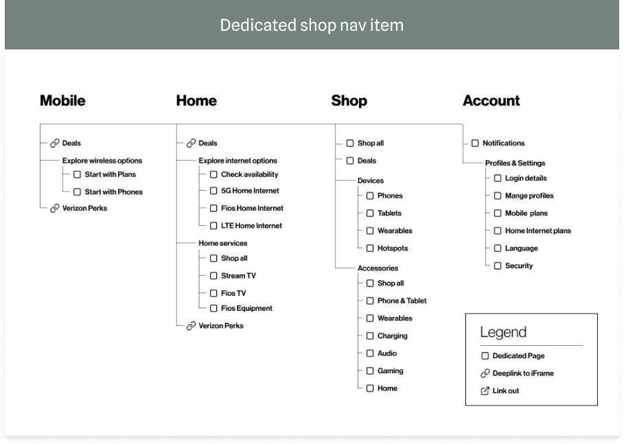
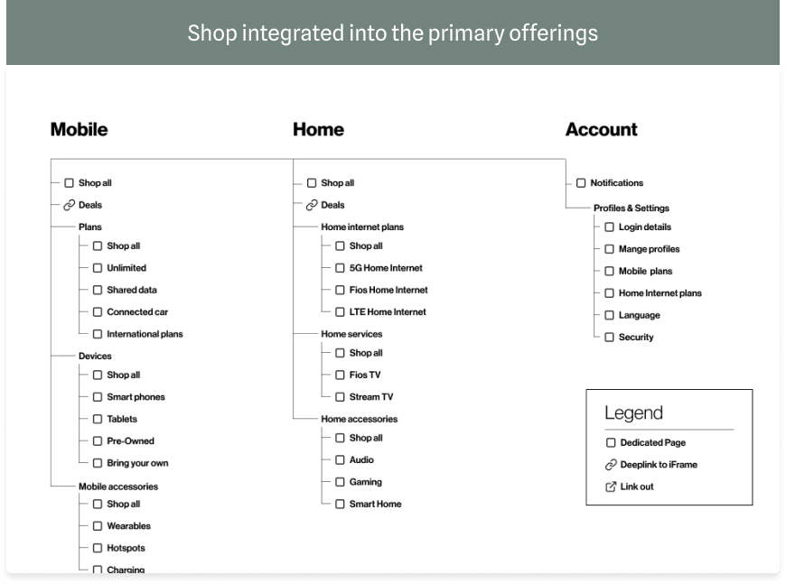
Unclear hierarchy with double navigation. Lack of clarity on separation between Wireless & Home for consumers.Unclear organization and definition of primary or secondary offerings. Product and service s arrangement within sections was unstructured.
Verizon customers were struggling to find the products. My team and I set out to update & simplify the My Verizon App information architecture. I was focused on revamping the IA for the shop experience in order to enable easy navigation & promote the discovery of new products.
Verizon customers were struggling to find the products. My team and I set out to update & simplify the My Verizon App information architecture. I was focused on revamping the IA for the shop experience in order to enable easy navigation & promote the discovery of new products.
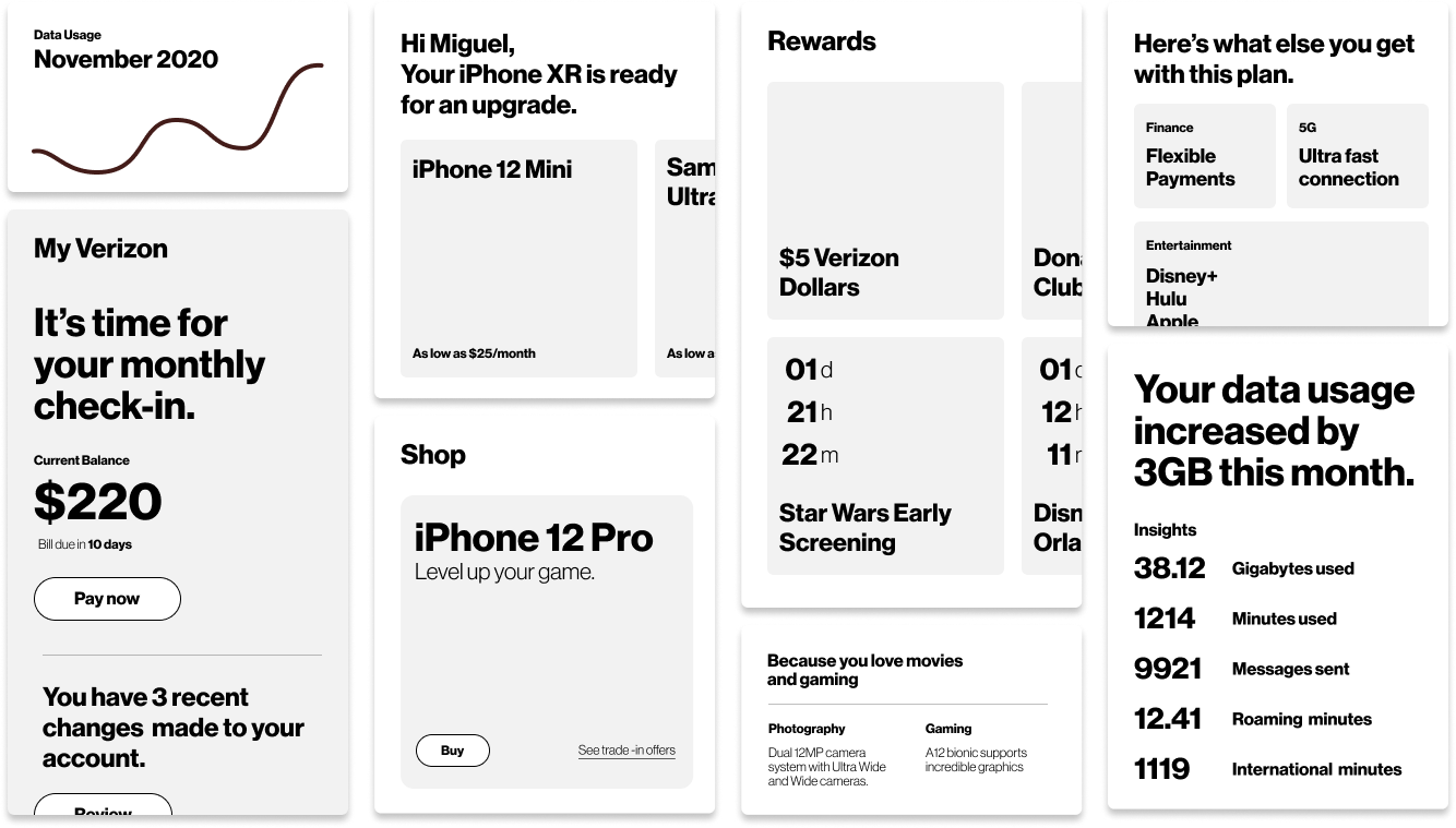
Increase in accessories sale due to the improved information architecture on desktop & mobile shop experiences
Of users found the new the improved information architecture significantly improved navigation & product discoverability
Customer-Centric Navigation Simplifies Discovery:
Including sub-navigation at the page level made it easier for customers to explore and discover products, emphasizing the importance of reducing friction in complex product ecosystems.
A/B Testing Validates Incremental Improvements:
Testing navigation ideas through A/B experiments highlighted that even small changes could lead to measurable improvements in customer engagement and slightly exceed metrics.
Clear Communication is Key in Merging Experiences:
Aligning business and consumer experiences required addressing logistical and communication gaps, underscoring the importance of cross-functional collaboration early in the design process.
Subcategory Curation Drives Brand Alignment:
Curating subcategory experiences aligned with the Verizon brand reinforced the need for consistent branding to improve trust and recognition across digital touchpoints.
Simplified Setup Improves Conversion:
Streamlining the user flow for accessory and service selection resulted in fewer drop-offs, revealing the critical impact of reducing cognitive load on conversion rates.